




Every Thursday morning, a colorful map of the United States updates online. Published by the National Drought Mitigation Center (NDMC) at the University of Nebraska–Lincoln, the U.S. Drought Monitor (USDM) garners intense public interest and holds massive real-world leverage.
The map isn’t just informational—it’s deeply actionable. USDM classifications directly trigger billions of dollars in federal disaster relief, including emergency aid to ranchers through the USDA’s Livestock Forage Program (LFP), and serve as a decision-making baseline for state and local drought plans.
How is this weekly snapshot actually drawn? In this post, we’ll explore what defines a drought, how experts construct the map, the inherent limitations of synthesizing complex climate data into a single weekly image, and how you can lend your voice to the process.
Defining Drought: Unlike some other natural hazards, such as hurricanes and tornadoes, there are numerous ways to define drought. According to the National Integrated Drought Information System, there are over 150 recorded definitions of drought in the academic literature. One of my favorites, from Dr. Kelly Redmond, simply defines it as “insufficient water to meet needs.” This principle is at the heart of most, if not all, reasonable definitions of drought.
One reason there are so many different definitions of drought is because there are so many ways to measure it. Drought can be measured according to meteorological indicators (such as precipitation), hydrological indicators (such as streamflow), ecological indicators (such as tree mortality), or economic indicators (such as crop yields). Image 1 from the U.S. Forest Service does a nice job illustrating this.
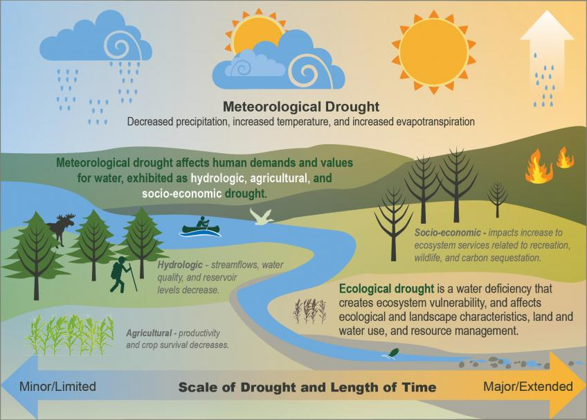
Image 1: Cartoon depicting different types of drought across varying ecoystems and timescales. Source: https://www.fs.usda.gov/managing-land/sc/drought
Different types of drought also occur over different timescales. For instance, oppressively hot and dry conditions at an important stage of growth for a crop like corn may cause crippling drought impacts to corn growers while having little impact on nearby lakes, reservoirs, or even trees with deep root systems.
The USDM defines drought severity by how rare a given dryness level is historically:
- D1 (Moderate): Below the 20th percentile (occurs 1 in 5 years)
- D2 (Severe): Below the 10th percentile (1 in 10 years)
- D3 (Extreme): Below the 5th percentile (1 in 20 years)
- D4 (Exceptional): Below the 2nd percentile (1 in 50 years)
Image 2 shows how these thresholds align on a standard normal distribution. Image 3 grounds this concept using 100 years of real precipitation data for Fort Collins, Colorado, overlaying the exact cutoff thresholds for each drought category.
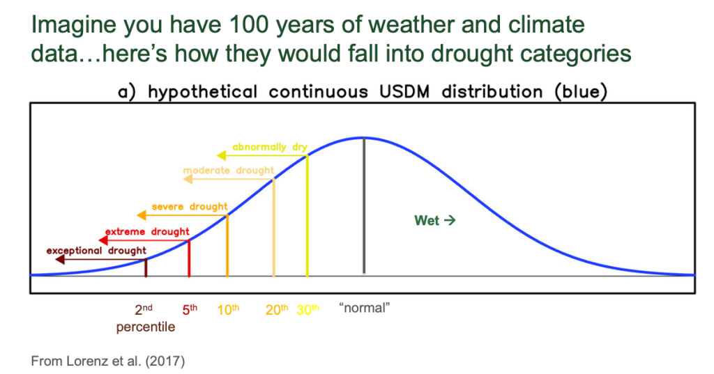
Image 2: Representation of each drought category using a typical probability density distribution from Lorenz et al. 2017.
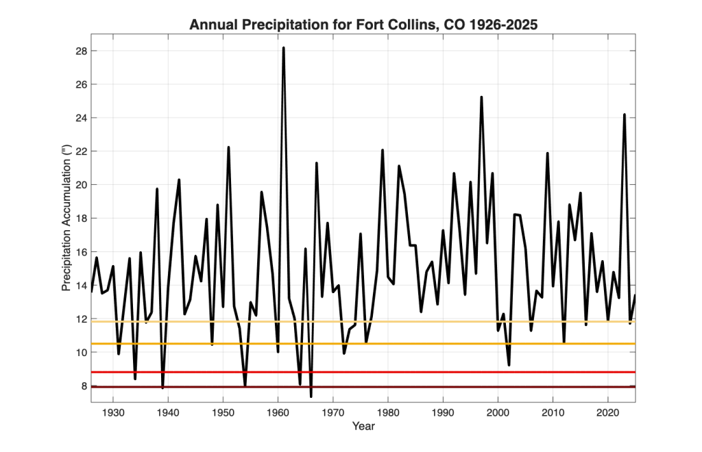
Image 3: Annual precipitation accumulations for Fort Collins, Colorado from 1926-2025. The thresholds for moderate drought (tan), severe drought (orange), extreme drought (red), and exceptional drought (burgundy) have been plotted alongside the precipitation measurements.
Drought thresholds depend on both location and time of year—D4 conditions look drastically different in Vermont in January than in Arizona in July. Colorado alone spans vast climate extremes. The high-altitude Tower weather station in the Park Range has never recorded less than 39.9 inches of annual precipitation in over 45 years. By contrast, rain-shadowed mountain valleys, like the San Luis Valley, average under 8 inches per year. In fact, an average rainfall year in Alamosa would qualify as exceptional (D4) drought in Fort Collins, and would be completely off the charts at Tower.
Creating the US Drought Monitor Map: How does the USDM (recent map shown in Image 4) assess current dryness? Do authors use precipitation data? Streamflow? Soil moisture? Vegetation health? The answer is all of the above—and more. USDM authors synthesize over 100 different indicators, including:
- Precipitation and Evapotranspiration: Meteorological fluxes tracked across short to long timescales.
- Hydrology: Snowpack, soil moisture, streamflow, and groundwater levels.
- Sector Impacts: On-the-ground effects on agriculture, ecology, and outdoor recreation.
These data streams come from weather stations, rain and stream gauges, satellite sensors, and numerical models. Each indicator acts as an “arrow in the quiver,” helping authors hone in on current conditions through a convergence of evidence approach—setting drought levels based on where the overall weight of the data points.
But the USDM isn’t just driven by algorithms; it relies heavily on human expertise. Every week, over 400 local experts—including State Climate Offices, University Extension services, the National Weather Service, NRCS, USGS, and the Farm Service Agency—provide feedback to the lead author. These local partners help translate dataset trends into real-world impacts.
Citizen scientists also play a key role. Ground-level insights flow in through Condition Monitoring Observer Reports (CMOR) and volunteer observers in the Community Collaborative Rain, Hail, and Snow (CoCoRaHS) network, who measure rainfall every morning and submit qualitative field reports to verify what datasets are showing on the ground.
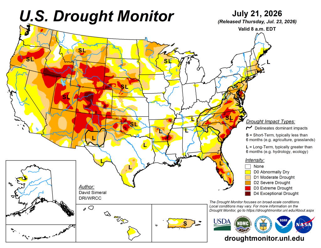
Image 4: Latest US Drought Monitor map
When most indicators align, establishing a “convergence of evidence” is more straightforward and drawing the map is more clear-cut. However, balancing over 100 data streams with feedback from hundreds of observers often reveals conflicting signals. For example, Image 5 shows a Condition Monitoring Report from a CoCoRaHS volunteer in Hayden, Colorado, reporting wetter-than-normal conditions right alongside data pointing in the opposite direction:
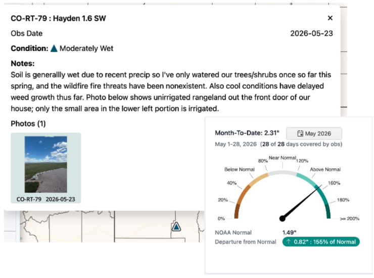
Image 5: Condition Monitoring Report from weather station near Hayden.
Would you believe that according to the US Drought Monitor this person was in the midst of a severe drought? April and May had brought wetter than normal conditions, but a record warm and dry winter brought abysmal snowpack to the nearby mountains. The Yampa River, which serves as the primary irrigation supply for the area, was running at very low levels (Image 6).
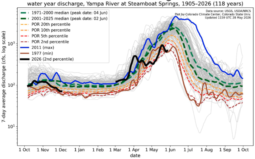
Image 6: 7-day average streamflows for the Yampa River at Steamboat Springs on May 28th, 2026. The black line shows the current year of data (October 2026 – May 2026). Each of the gray lines show a previous year of record. The brown line shows the record low flow year, and the blue line shows the record high flow year. The green lines show the mean and median years, and the colored lines show flows corresponding to each drought category listed above.
Limitations: The U.S. Drought Monitor has important limitations that users should keep in mind. Most glaringly, it attempts to distill a multifaceted hazard—with over 150 definitions—into a single map. Drought impacts vary across sectors and space. Impacts can even shift dramatically from one field to the next. As Kelly Redmond noted, “In essence, as with rainbows, each person experiences their own drought.“A single weekly map simply cannot capture every localized reality. In trying to be everything to everyone, the map can sometimes obscure the nuanced picture on the ground.
Drought in a changing climate: Human-driven greenhouse gas emissions are rapidly shifting our baseline climate. In regions like the American Southwest, a long-term aridification trend is underway that is unlikely to reverse anytime soon. Conditions that used to occur only once every 20 (or more) years are becoming far more frequent. As a result, the USDM’s baseline thresholds are constantly moving. A level of dryness that qualified as an extreme (D3) drought 30 years ago might only rank as moderate (D1 or D2) by today’s standards. For example, if we use temperature rather than precipitation for our Fort Collins baseline, rising average temperatures shift our percentile thresholds upward over time (Image 7). While researchers are actively developing more effective frameworks to define drought in a warming world, solving this moving-target problem remains an ongoing challenge.
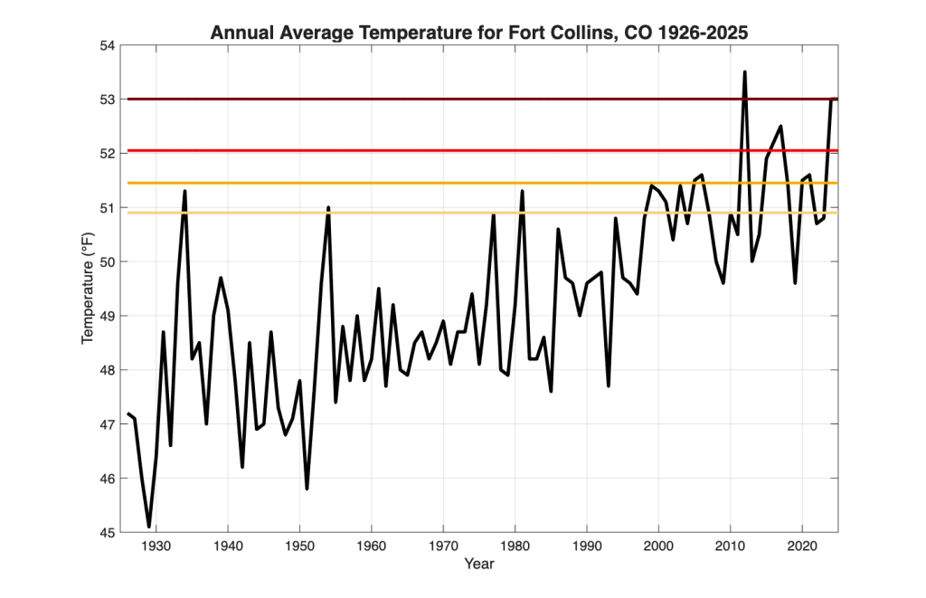
Image 7: Annual average temperatures for Fort Collins, Colorado from 1926-2025. The thresholds for moderate drought (tan), severe drought (orange), extreme drought (red), and exceptional drought (burgundy) have been plotted alongside the temperature measurements.
Strengthening the Map: The National Drought Mitigation Center understands the limitations discussed here. Perhaps the best way to improve the USDM is active public participation. The US Drought Monitor authors, and many of the people who contribute to it (including us) really do look at your impact reports every week. Bottom-up impact reporting is essential to getting the map right.
Two great ways to contribute are:
- Condition Monitoring Observer Reports (CMOR): Submit detailed notes and photos about localized drought impacts directly to the NDMC.
- The CoCoRaHS Network: Join over 20,000 active volunteers who log daily backyard rainfall measurements. Observers can also submit weekly Condition Monitoring Reports (as shown in Image 8) using helpful, step-by-step guides to ensure field observations deliver maximum value.
Tracking drought across complex landscapes is inherently tough—but it becomes more accurate when local observers lend their voices to the collective wisdom of the map.
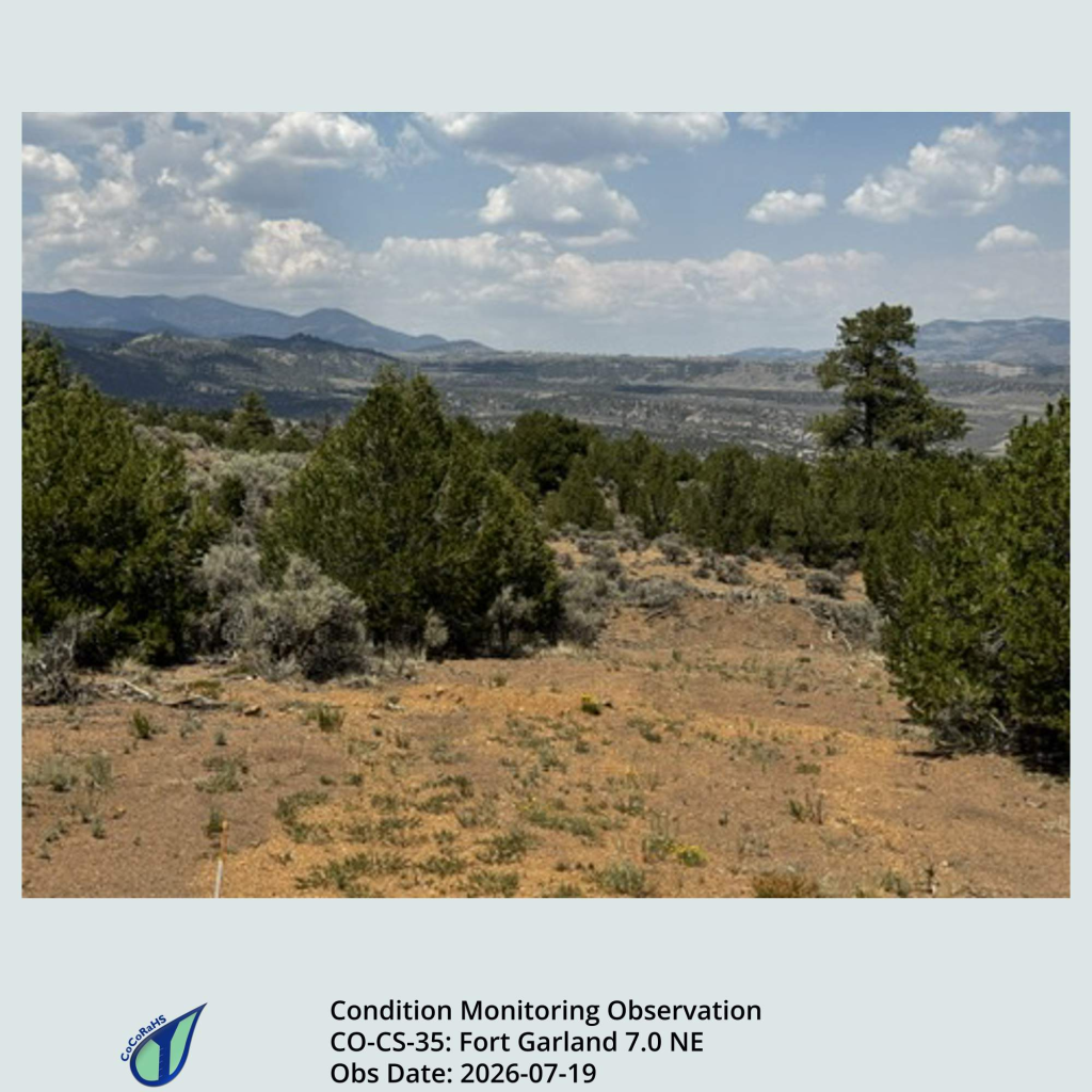
Image 8: Photo showing dry conditions near the Fort Garland area in Colorado’s San Luis Valley. This photo was submitted by a CoCoRaHS observer.
 Allie Mazurek
  Russ Schumacher